Velocity Black - Brand Refresh
I joined forces with the team at AKQA to create a refreshed identity for Velocity Black, a digital luxury concierge and lifestyle management service.
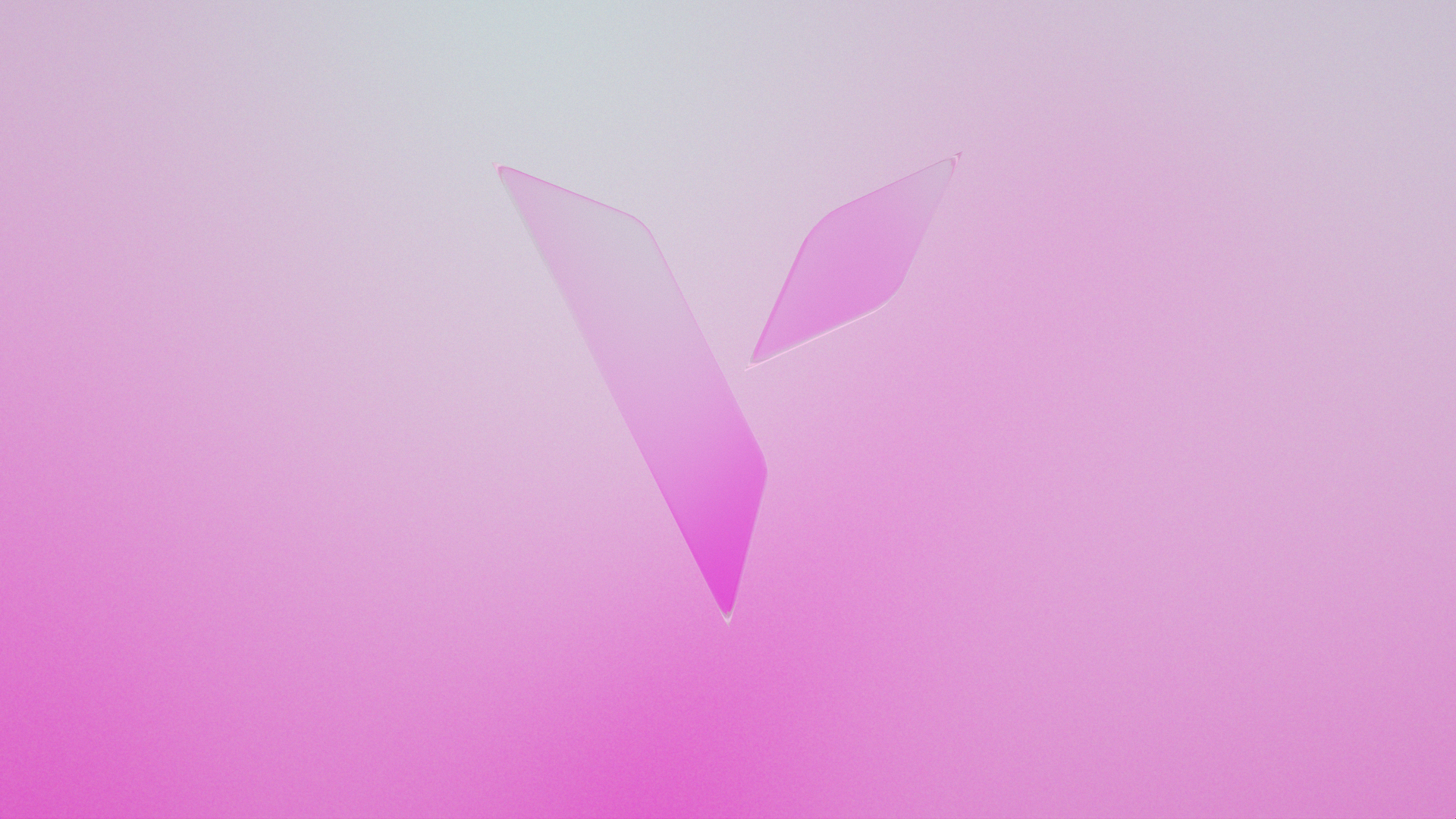
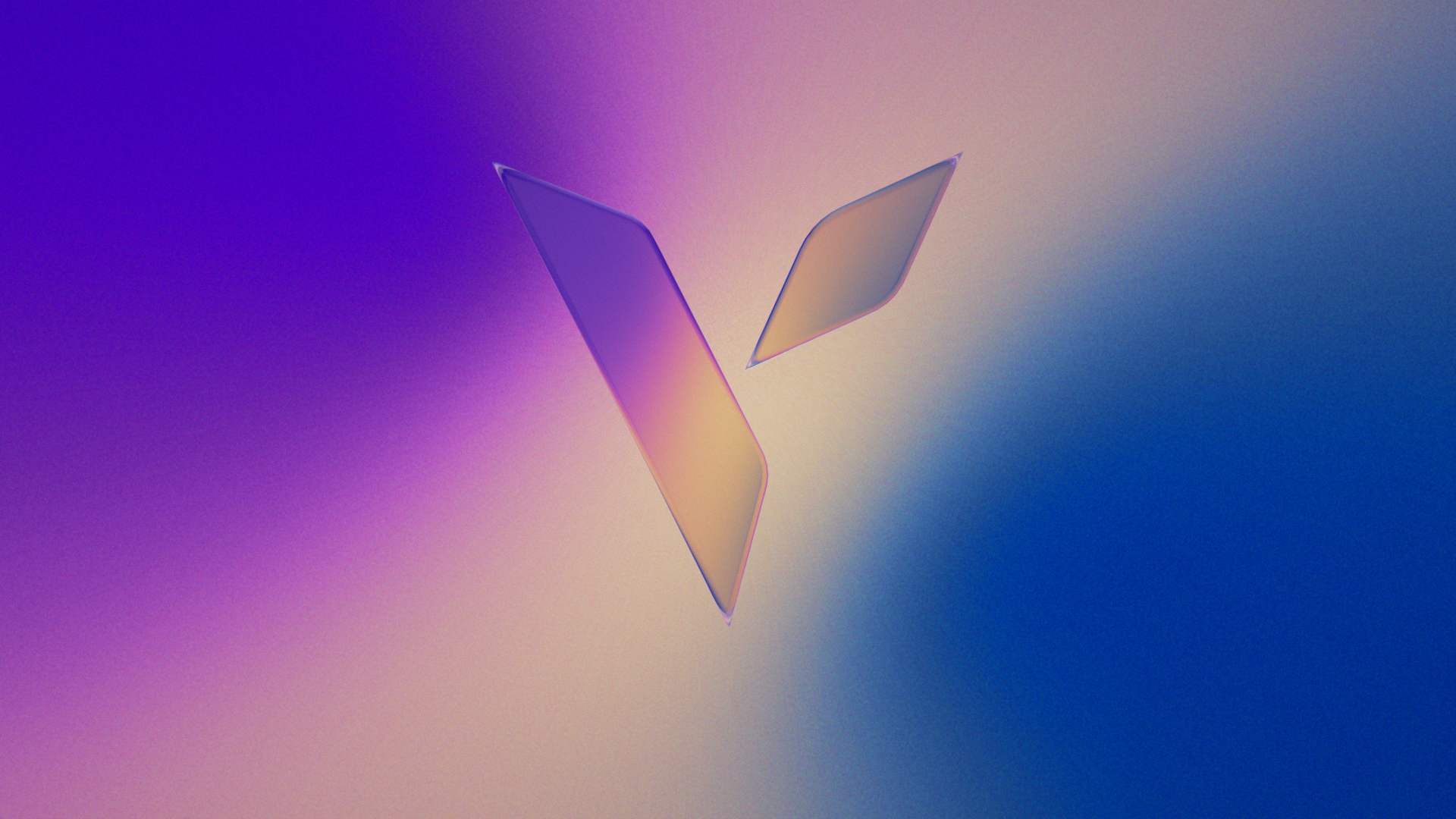
The new identity was built around the concept of time, which mirrors the 24/7 service that’s provided to private members. This was realised through a colour palette inspired by the ever-changing sky as it seamlessly cycles between dawn, daylight, and dusk, conveying that any moment on any day can be special with Velocity Black.
I helped to develop and art-direct the motion identity.
Development
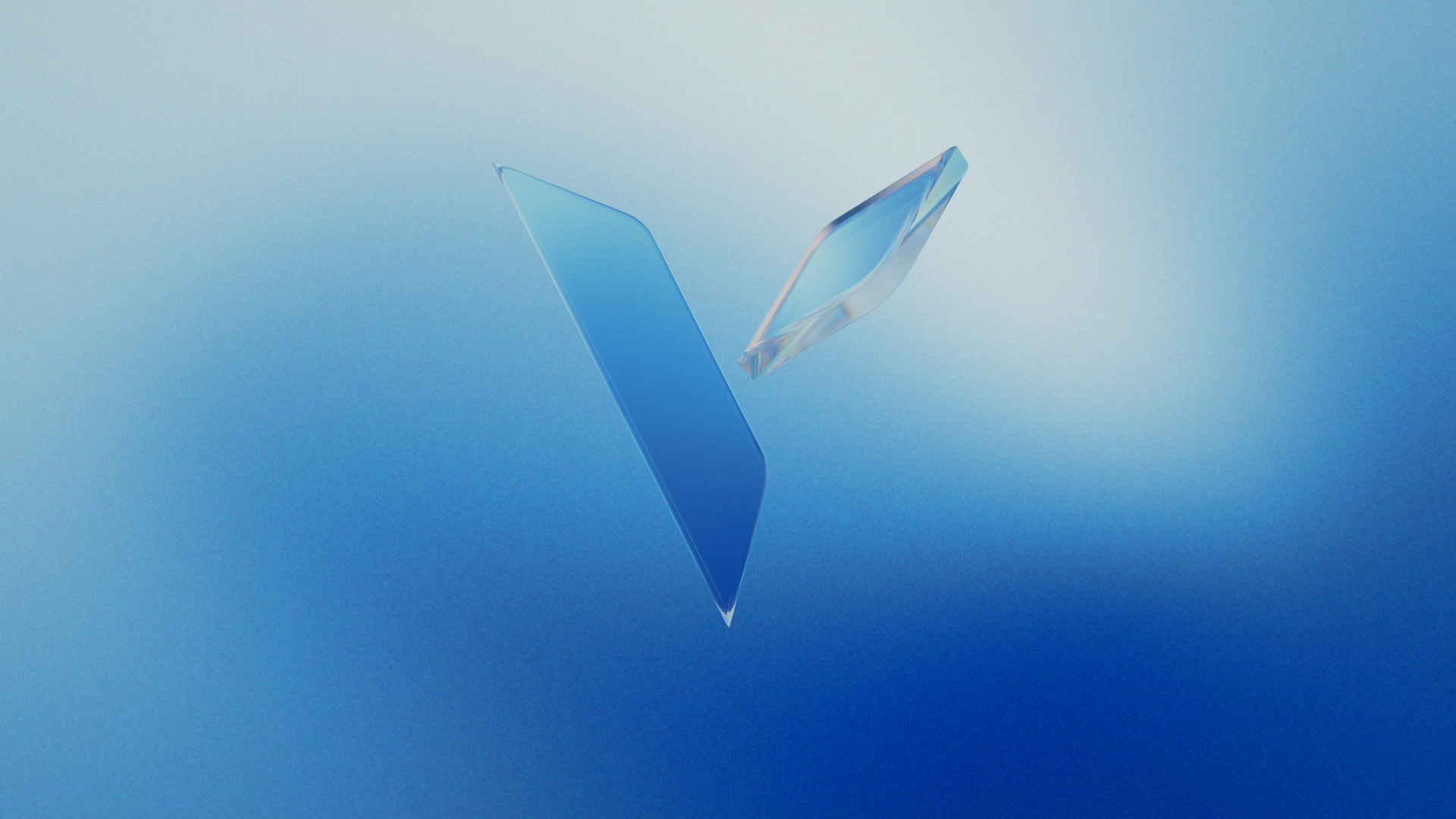
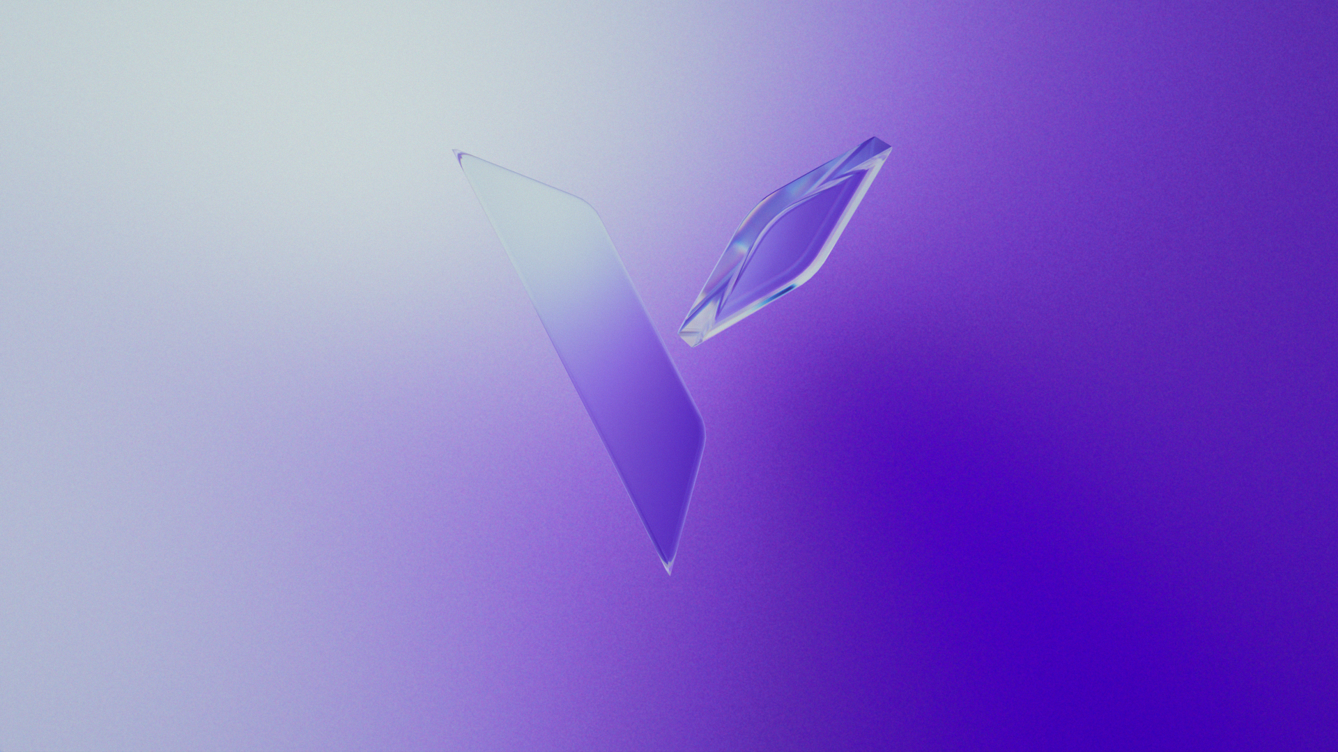
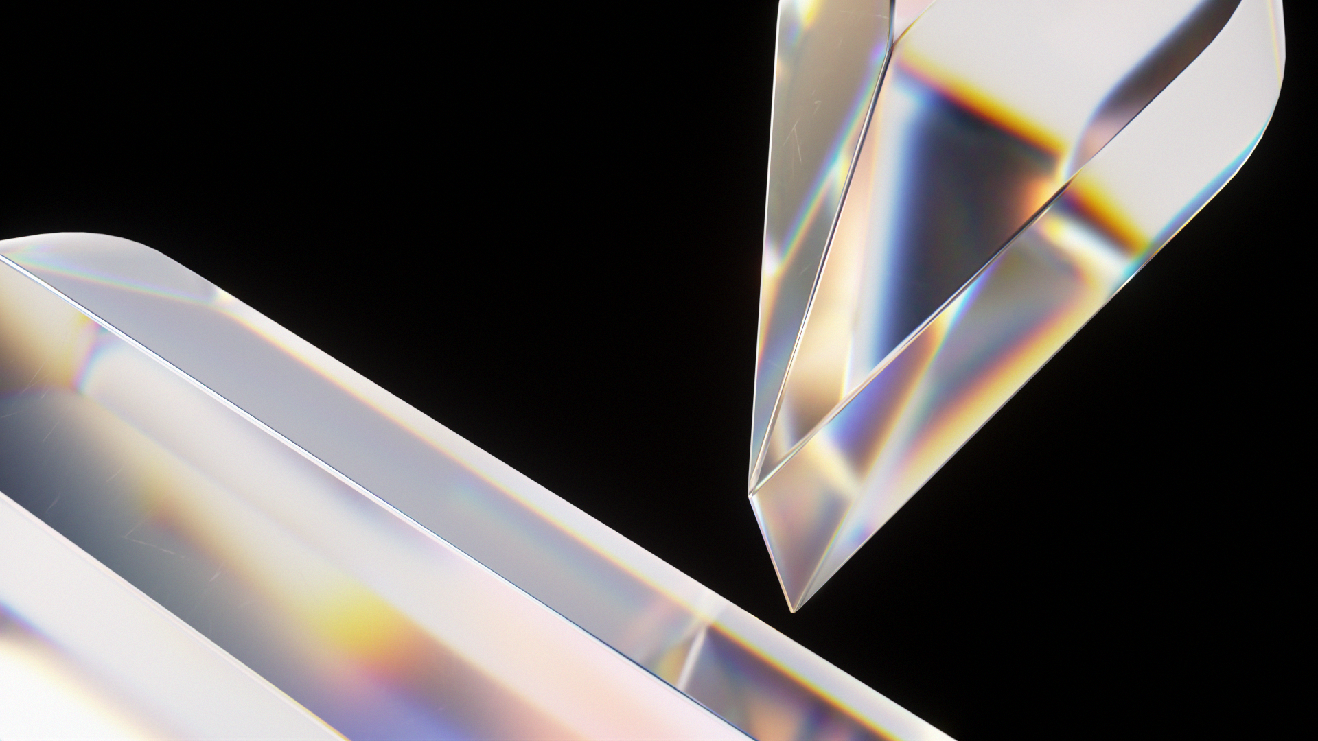
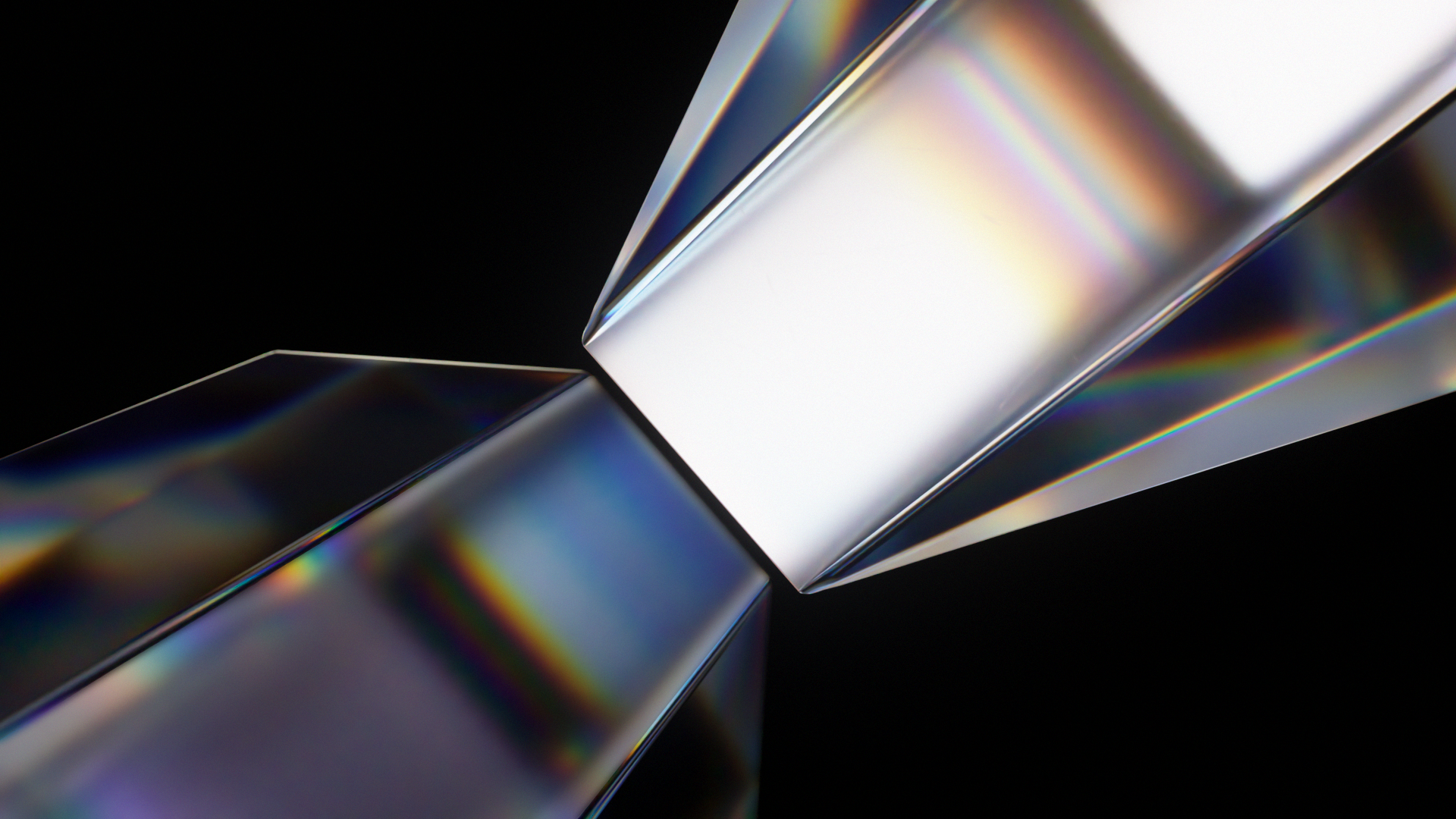
The visual language was inspired by the idea of “the prism effect,” a treatment derived from the properties of glass, including refraction and the way light interacts with the material. It served as a symbol of a single source transforming into a limitless spectrum, capturing the constantly evolving and countless experiences that enhance every facet of life.
During R&D, I explored how the glass treatment of the logo refracted the gradient backgrounds, with hues, density, and form organically shifting between states, moving harmoniously in perpetual motion.
Earlier in the process, the direction of “the prism effect” treatment was muted in colour, relying on glass as the sole visual device while maintaining the same essence, leaning toward evoking mystery, exclusivity, and timelessness, reflecting a service that lets life unfold without end.
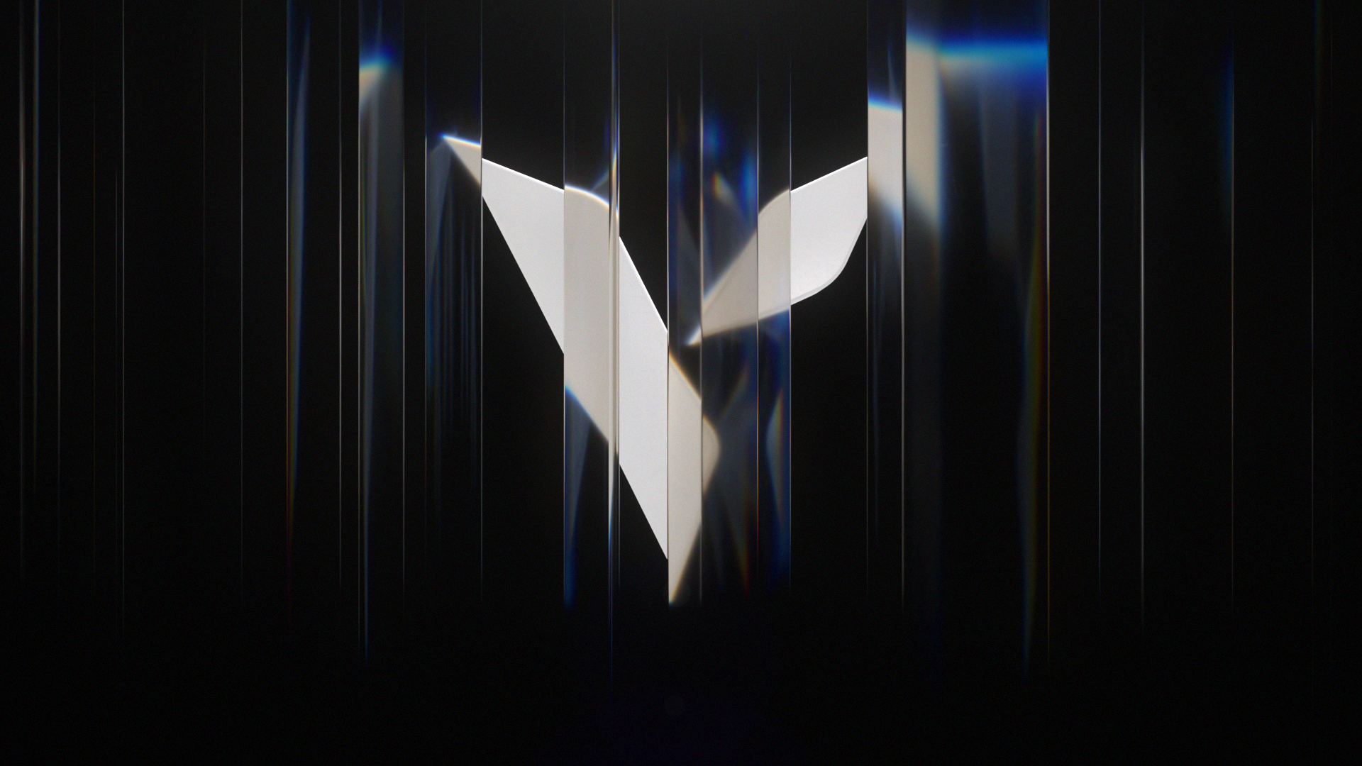
I explored several solutions, including panes of glass refracting the logo itself with both varying and uniform depth and scale, alongside contrasting lighting setups using rim and key lights. These foundations led to the logo being made of glass as a hero element, complemented by the right-side arm subtly rotating, creating a distinct animated motif.
